Sections
Focus has 16 ready-to-use sections.
1-3 column text
One fullwidth column with content and 3 more columns below it.
2 column text
2 columns of text, image and button.
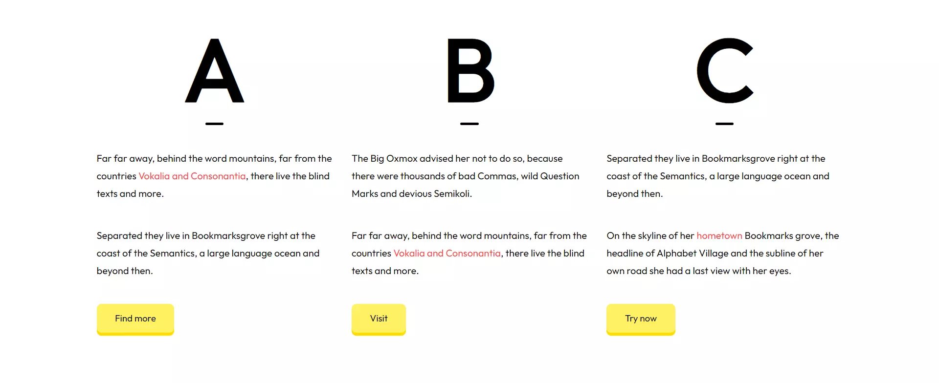
3 column text
3 columns of texts with big capital letters/numbers above them.
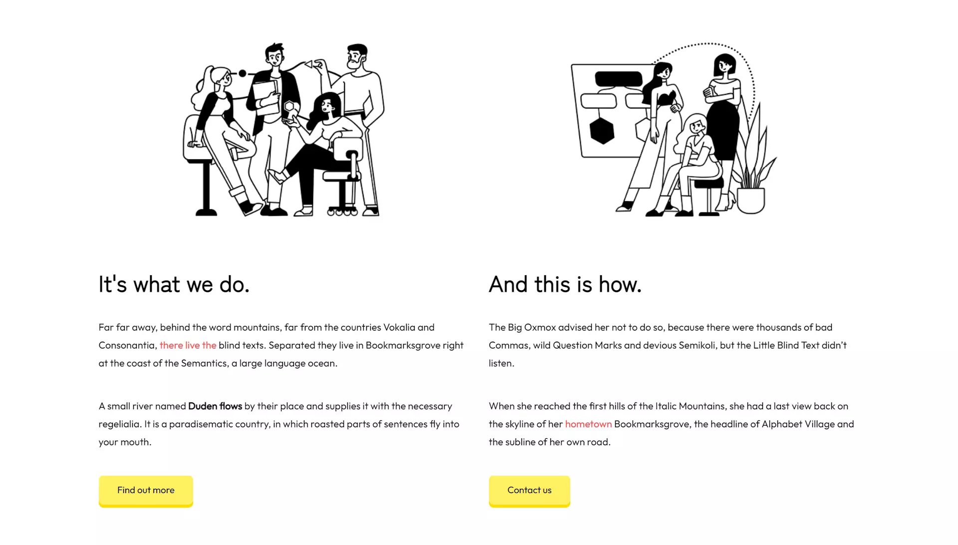
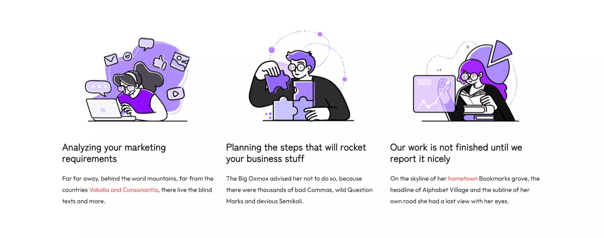
3 column text with image
3 columns of text content with image.
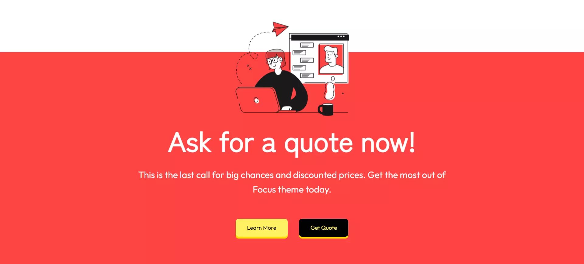
Call-to-action
A fullwidth call-to-action section which includes the CTA section module.
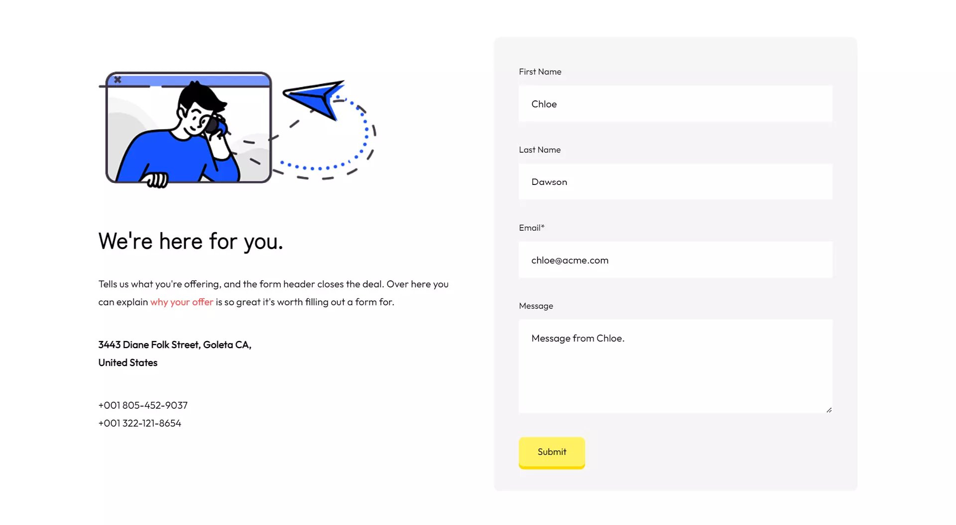
Contact info
An image, address information and a contact form.
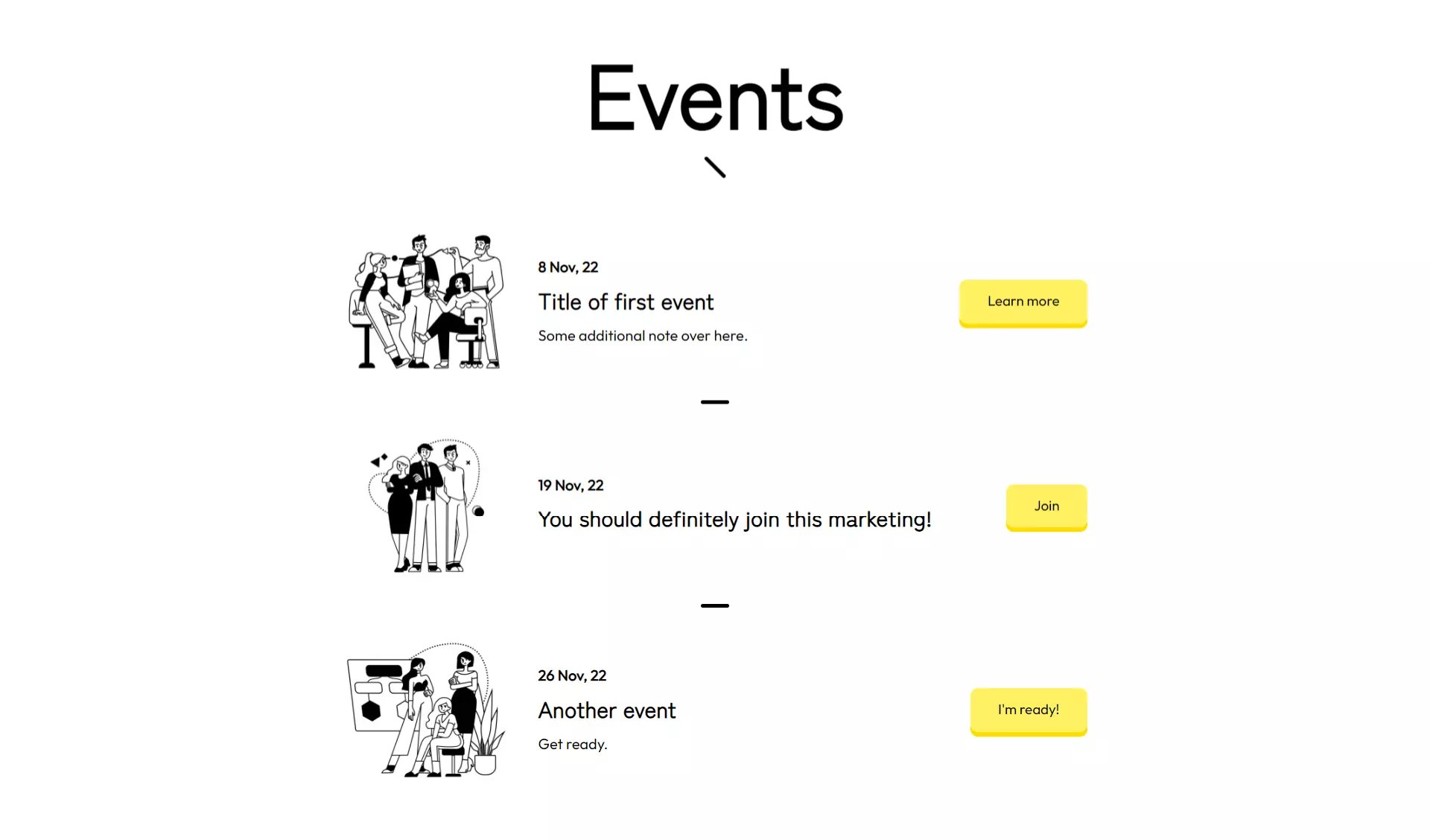
Events
An event list section with a title and Events module.
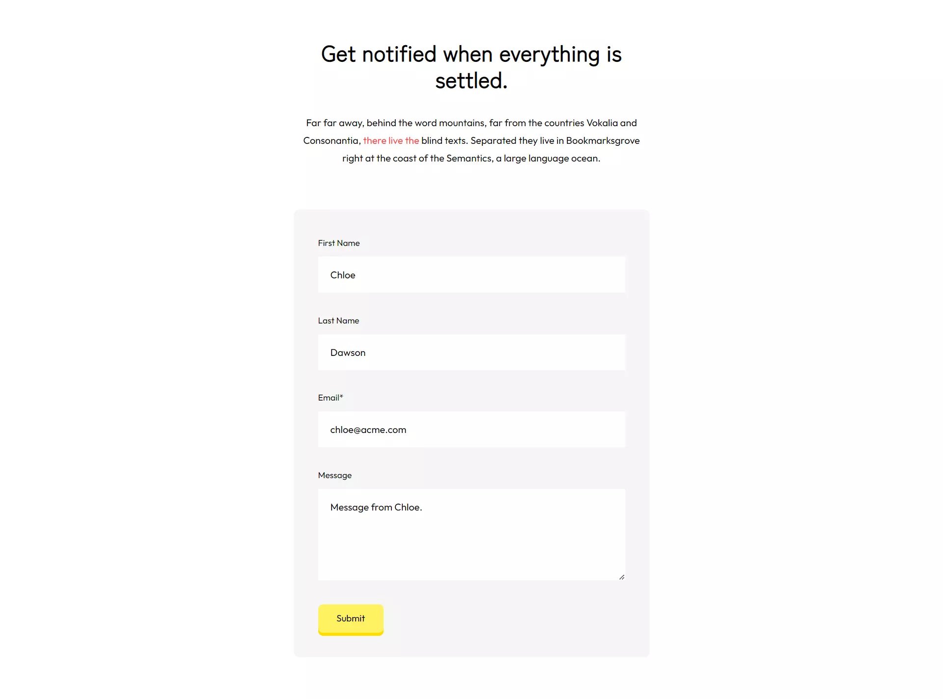
Form with title and text
A form with title and text above it.
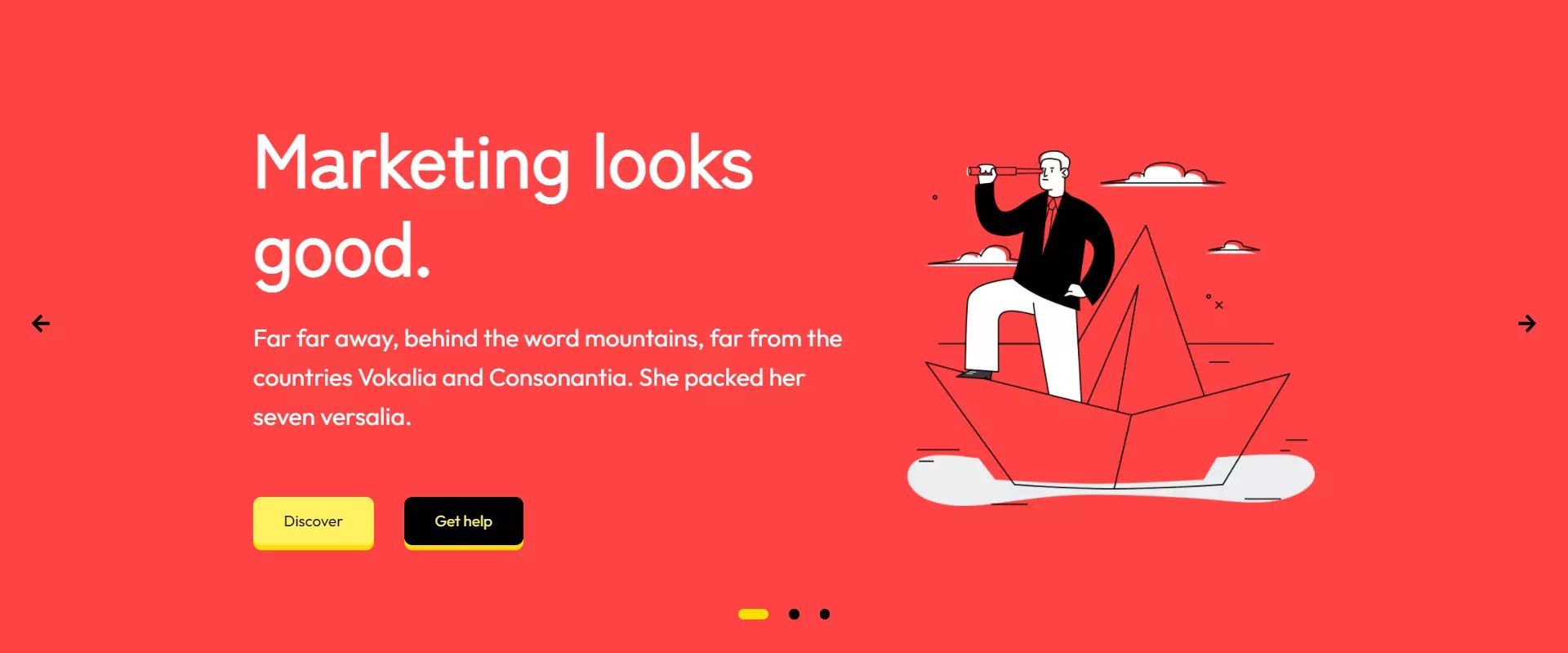
Hero slider
Fullwidth hero slider with 3 slides.
Page title
Page title section for placing at the top of pages.

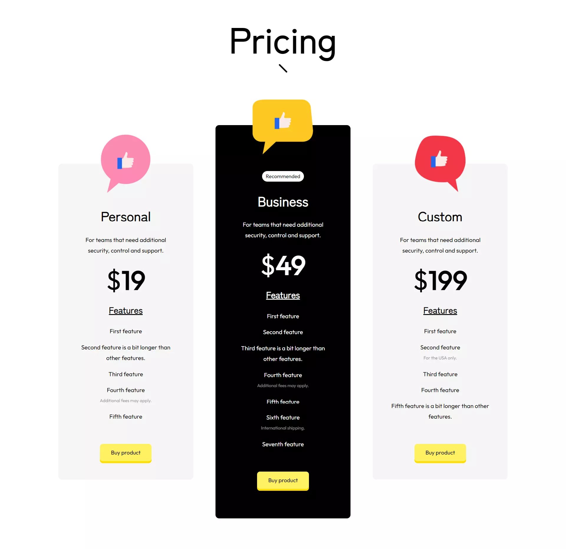
Pricing
Pricing cards for your plans.
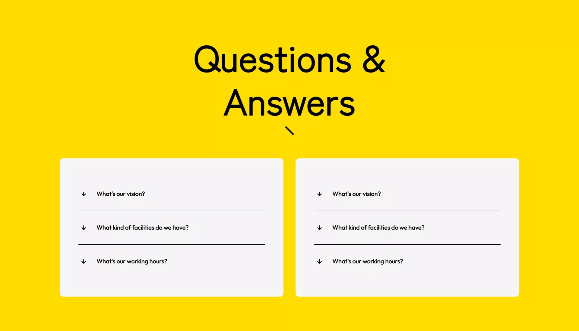
Questions & answers
Questions & answers (FAQ) section with accordions.
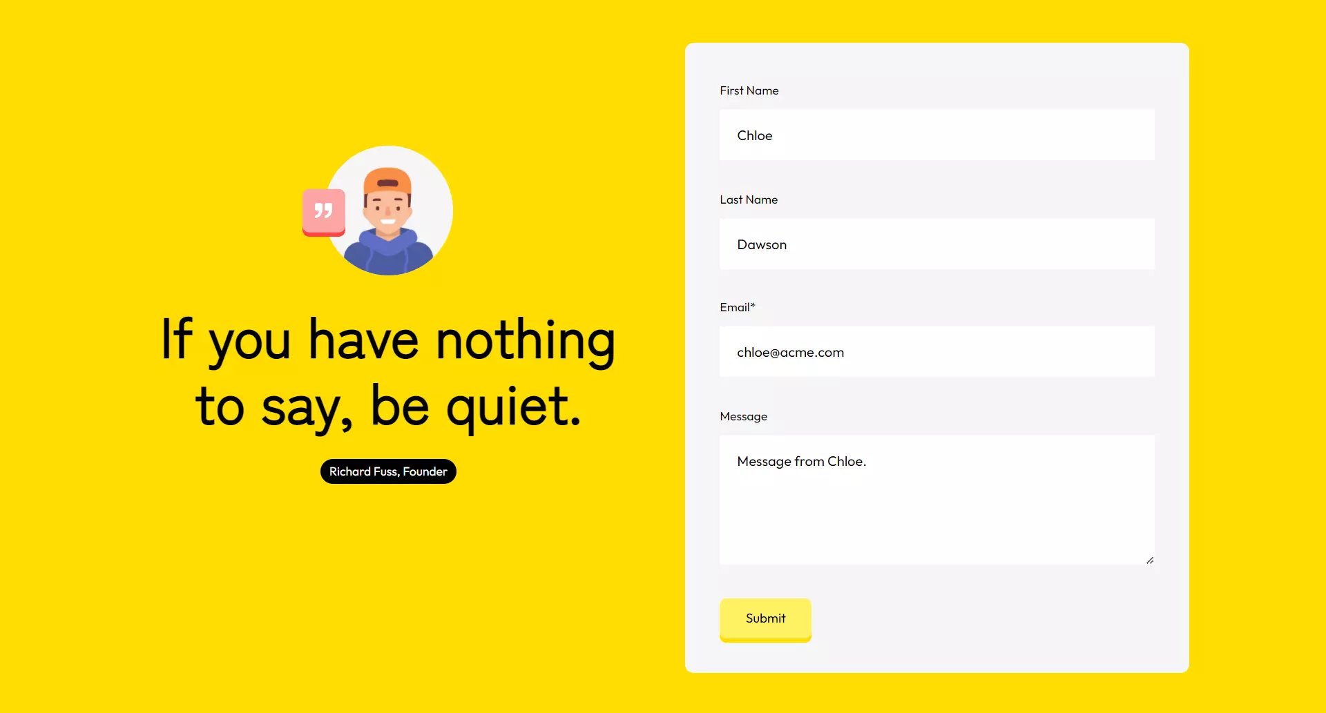
Quote and form
A quote module and a form next to it.
Quote
A quote section with the Quote module in it.

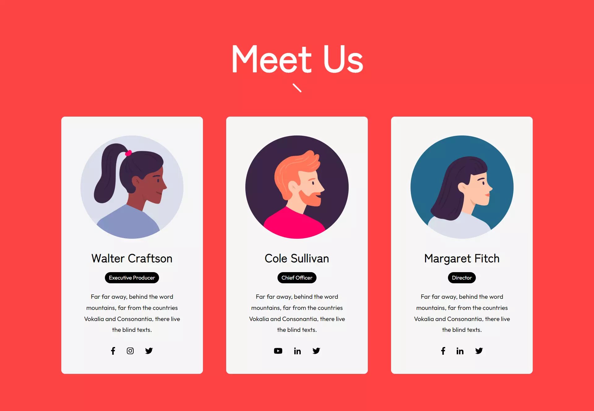
Team
A title and 3 person cards.
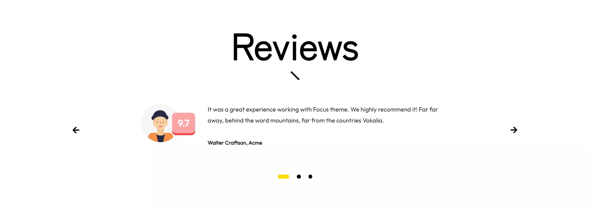
Testimonials
A section for your customer reviews.
Modules
Focus has 29 ready-to-use modules.
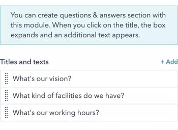
Accordion
You can create questions & answers section with this module. When you click on the title, the box expands and an additional text appears.
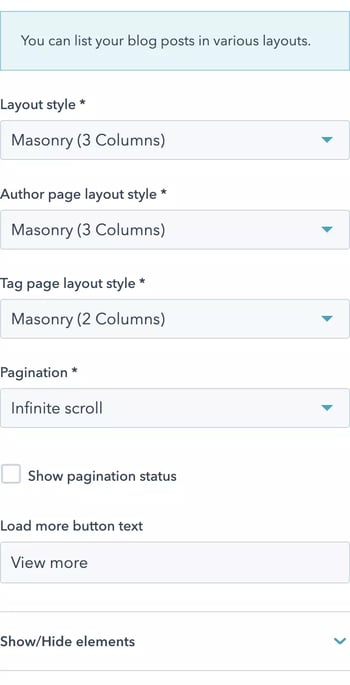
Blog listings
You can list your blog posts in various layouts.
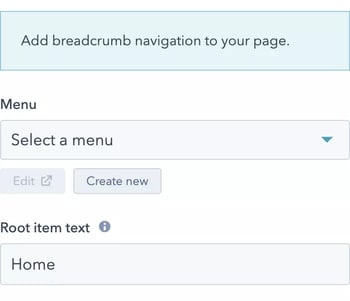
Breadcrumb
Add breadcrumb navigation to your page.
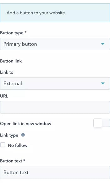
Button with link
Add a button to your website.
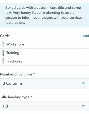
Cards
Boxed cards with a custom icon, title and some text. Very handy if you're planning to add a section to inform your visitors with your services, features etc.
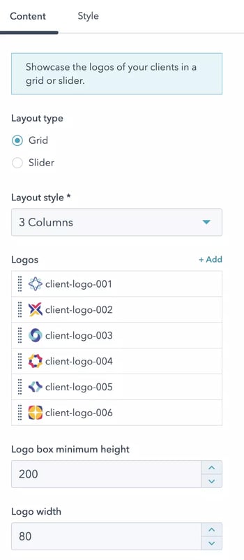
Clients
Showcase the logos of your clients in a grid or slider.
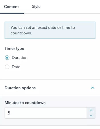
Countdown timer
You can set an exact date or time to countdown.
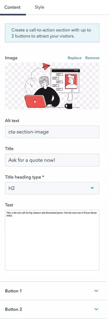
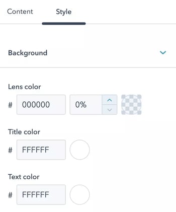
CTA section
Create a call-to-action section with up to 2 buttons to attract your visitors.
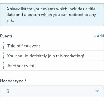
Events
A sleek list for your events which includes a title, date and a button which you can redirect to any link.
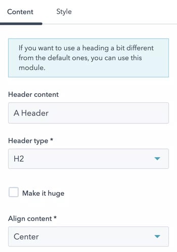
Fancy header
If you want to use a heading a bit different from the default ones, you can use this module.
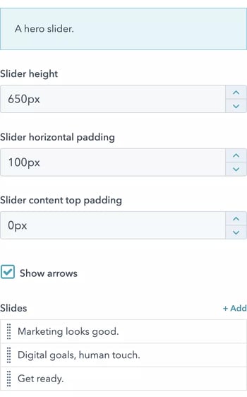
Hero slider
A hero slider.
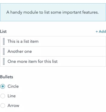
List
A handy module to list some important features.
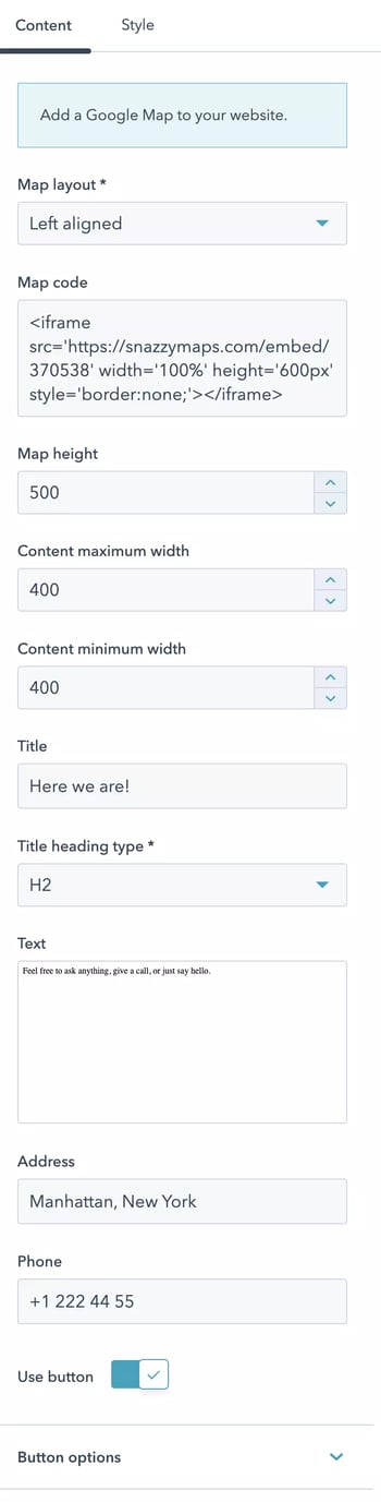
Map
Add a Google Map to your website.
Media boxes
Create shiny boxes with some texts and images.
Menu
Add a menu to your website.
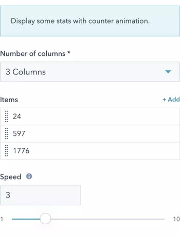
Number counters
Display some stats with counter animation.
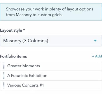
Portfolio
Showcase your work in plenty of layout options from Masonry to custom grids.
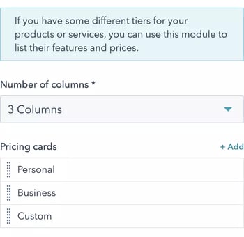
Pricing cards
If you have some different tiers for your products or services, you can use this module to list their features and prices.
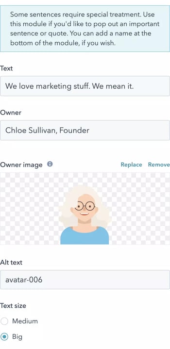
Quote
Some sentences require special treatment. Use this module if you'd like to pop out an important sentence or quote. You can add a name at the bottom of the module, if you wish.
SEO schema
Add schema.org to your website.
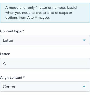
Single letter/number
A module for only 1 letter or number. Useful when you need to create a list of steps or options from A to F maybe.
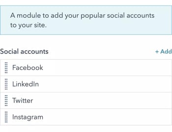
Social accounts
A module to add your popular social accounts to your site.
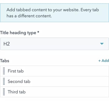
Tabs
Add tabbed content to your website. Every tab has a different content.
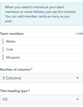
Team members
When you need to introduce your team members or some fellows, just use this module. You can add member cards as many as you wish.
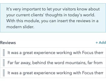
Testimonials
It's very important to let your visitors know about your current clients' thoughts in today's world. With this module, you can insert the reviews in a modern slider.
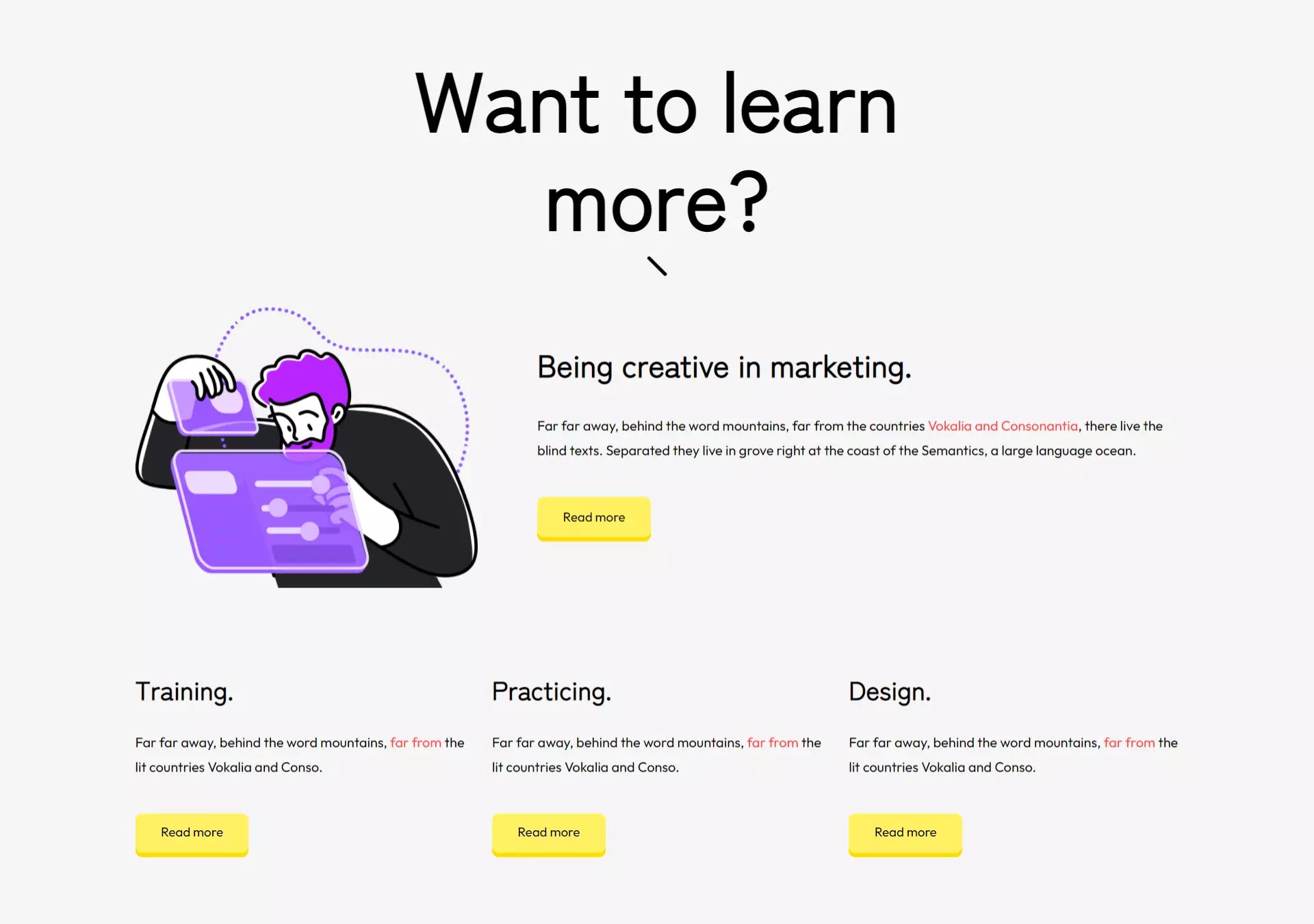
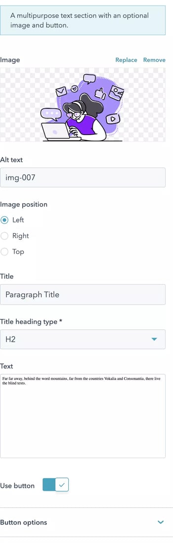
Text with image
A multipurpose text section with an optional image and button.
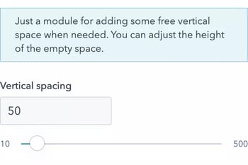
Vertical spacer
Just a module for adding some free vertical space when needed. You can adjust the height of the empty space.
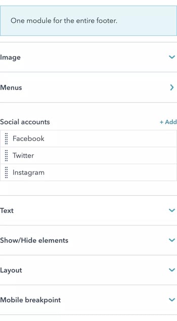
Website footer
One module for the entire footer.
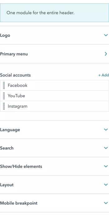
Website header
One module for the entire header.